


Seeing a Decade of Street Photography Turning into a Monograph (Part 2): The Design
On storytelling, growth, and the power of printed work

In a previous story about my ongoing project of creating my first monograph called Seeing the Quiet, I shared the first steps of turning my street photography into a book, explaining why I decided to take this step and what creating it means to me. You can catch up here if you missed it.
Today, I want to share with you the current phase: shaping the book itself.
A photographer's monograph is more than just a collection of images bound together. It’s a visual experience that guides the reader through a narrative, much like the story behind a film or novel. Otherwise, it risks becoming a paper version of your Instagram profile.
The process is both thrilling and frustrating. You start with a creative urge to make sense of it all, a rough idea, a pile of small prints, and a vision. Then comes the real challenge: making it all work as a cohesive whole.
Editing: More than just picking your best shots
The hardest part of creating a photobook isn’t the photography itself — it’s the editing.
You photograph what speaks to you. Not every photograph belongs in a book, though. Some stand beautifully alone but disrupt the flow when placed among others. Others gain new meaning when paired with the right companion. You must learn to kill your darlings.
Editing the content of a monograph is about selection, sequencing, and pacing.
Selection: What stays, what goes
A monograph isn’t a “greatest hits” album.
At first, you think you know by heart which images will cut. You print your favorites, spread them across the floor, and begin arranging them. But as you move them around, you realize that not all of them fit the visual stories you want to tell.
In the case of Seeing the Quiet, photographs tell stories of quietude that are hidden in fragments of collective and anonymous everyday lives. These stories invite to pause, de-puzzle, and reflect.
Let me illustrate with a few examples.
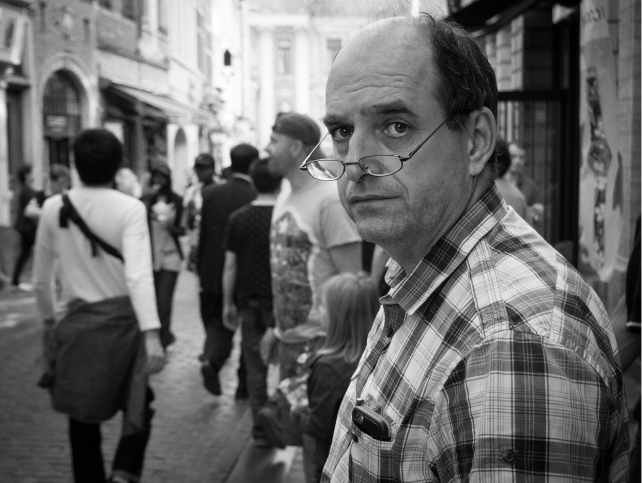
This is a simple street portrait made in downtown Brussels, which the monograph won’t include. Beyond the subject's surprised expression, there is not much to tell.
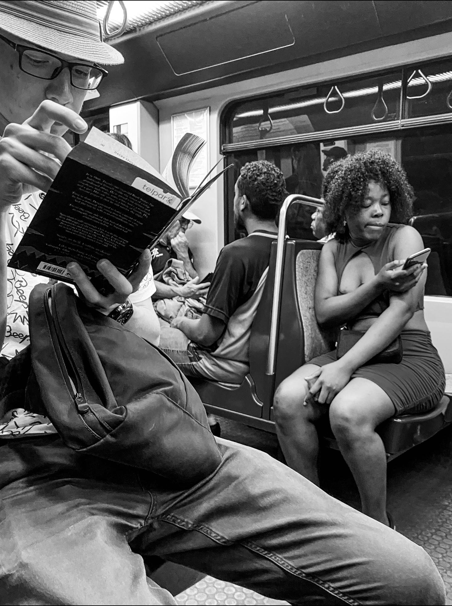
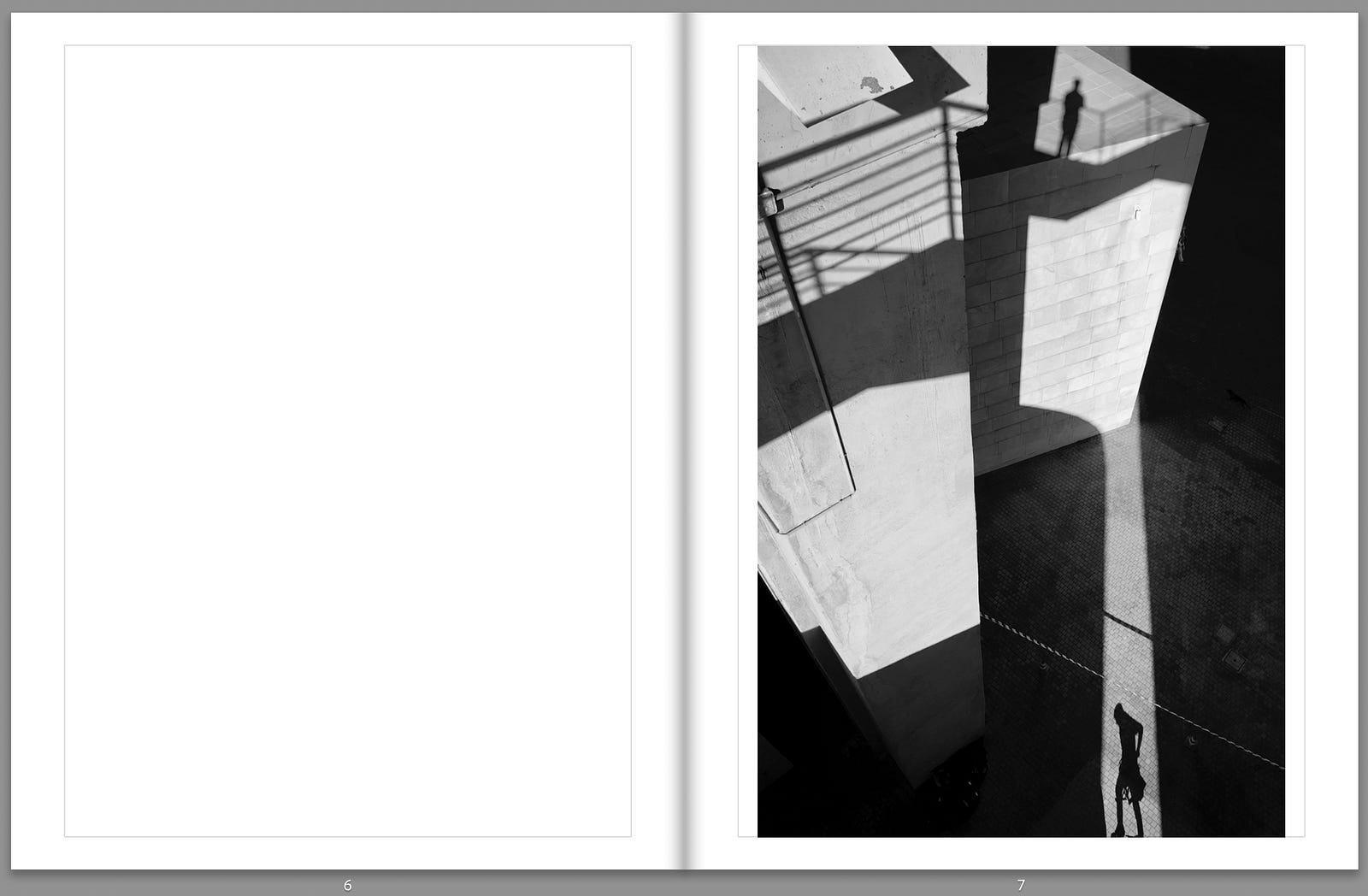
This close-up in a Lisbon subway allows for questions, pairings, and metaphorical interpretations. It’ll be one of the frames of the monograph.
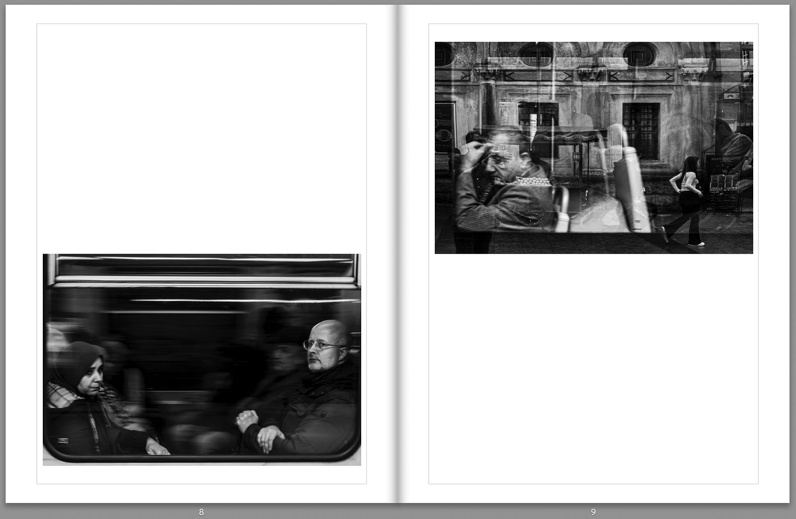
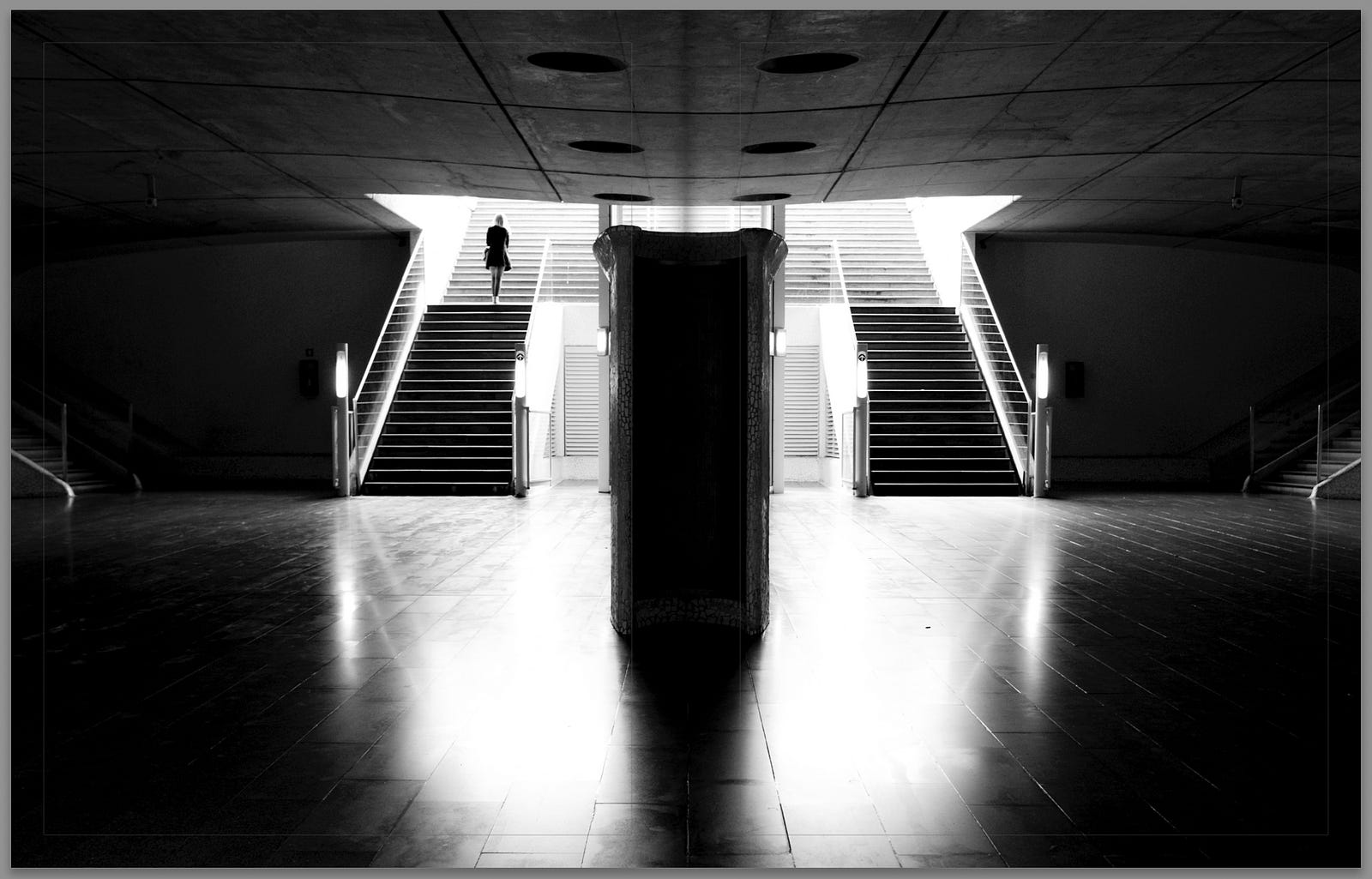
Another one that will make it to the book is all this negative space. It’ll be part of some of the graphical diptychs and triptychs included throughout the book.
Sequencing: Telling a story without words
Once you have a refined selection, focus on the flow of the images. Sequence is essential; the order in which photographs appear creates meaning.
Allowing the photographs to “speak” to each other helps further refine the selection through sequencing.
Should the book begin with a sense of mystery to draw the viewer in? Should it incorporate moments of contrast — light after dark, solitude after chaos? Should it start or end with questions?
It is a torturous path, and it helps to gather opinions about the sequencing together with the publisher’s editorial assistant and also your friends and family.
Small, cheap prints of all the potential photographs are a great way to get an overview and touch and feel the sequences.
Some sequences clicked instantly. Others took hours of rearranging before they felt right.
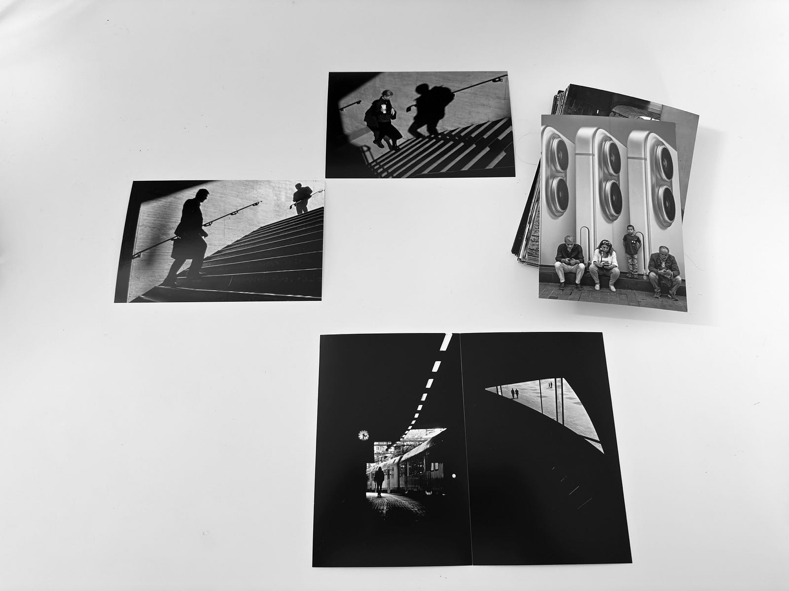
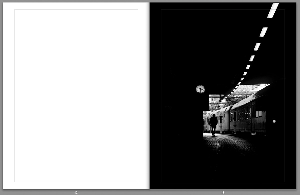
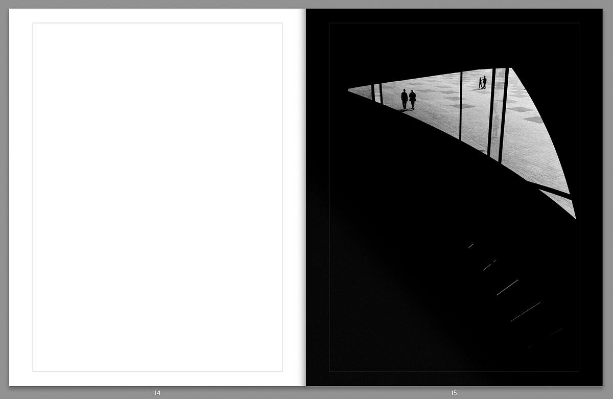
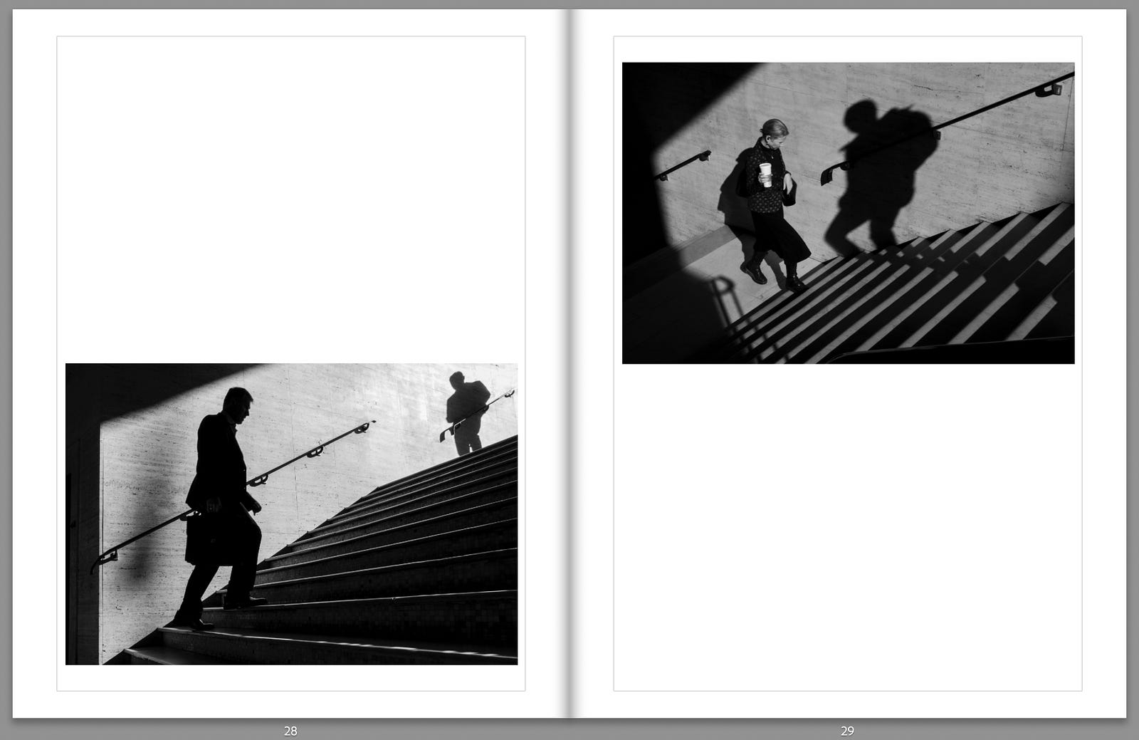
The two photographs in the sequence below have time as the underlying metaphor that links them together.
When meaning starts to emerge, you draft your sequences. I use the book module of Lightroom Classic to do it, knowing that later the publisher (Snap Collective) will support it in a future edition closer to the final product.
Pacing: Controlling the rhythm of the experience
Just as in music or film, rhythm matters in a photobook. If every page is filled with high-impact photographs, the experience becomes exhausting. If every image is given the same weight, nothing stands out.
You must play with variations.
Some spreads feature a single, large image commanding attention.
Others place two images in dialogue, creating tension or harmony.
Some pages are left blank, offering a moment of rest before the next movement.
These decisions shape how the book is felt — not just seen.
Designing the layout: Where the book takes shape
With the images sequenced, the next challenge is presentation.
A photobook is a physical object, and format, typography, and materials all contribute to the experience.
Format: Size and shape
Should the book be small and intimate or large and immersive? Should it be square, like classic photobooks? Should it be in a landscape format that is aligned with the human vision and like a cinema screen? Portrait?
My Lightroom database tells me that approximately half of my photographs have a portrait aspect ratio, which is probably higher than typical. I am often instinctively drawn to the vertical format, which complements the figures wrapped in light and shapes, which are familiar compositions in my work.
Given the number of vertically oriented photographs, and with the option of using two-page spreads for landscape images when necessary, the natural choice for the book’s format was portrait. It will comprise around one hundred pages, including text.
Text: To include or not to include?
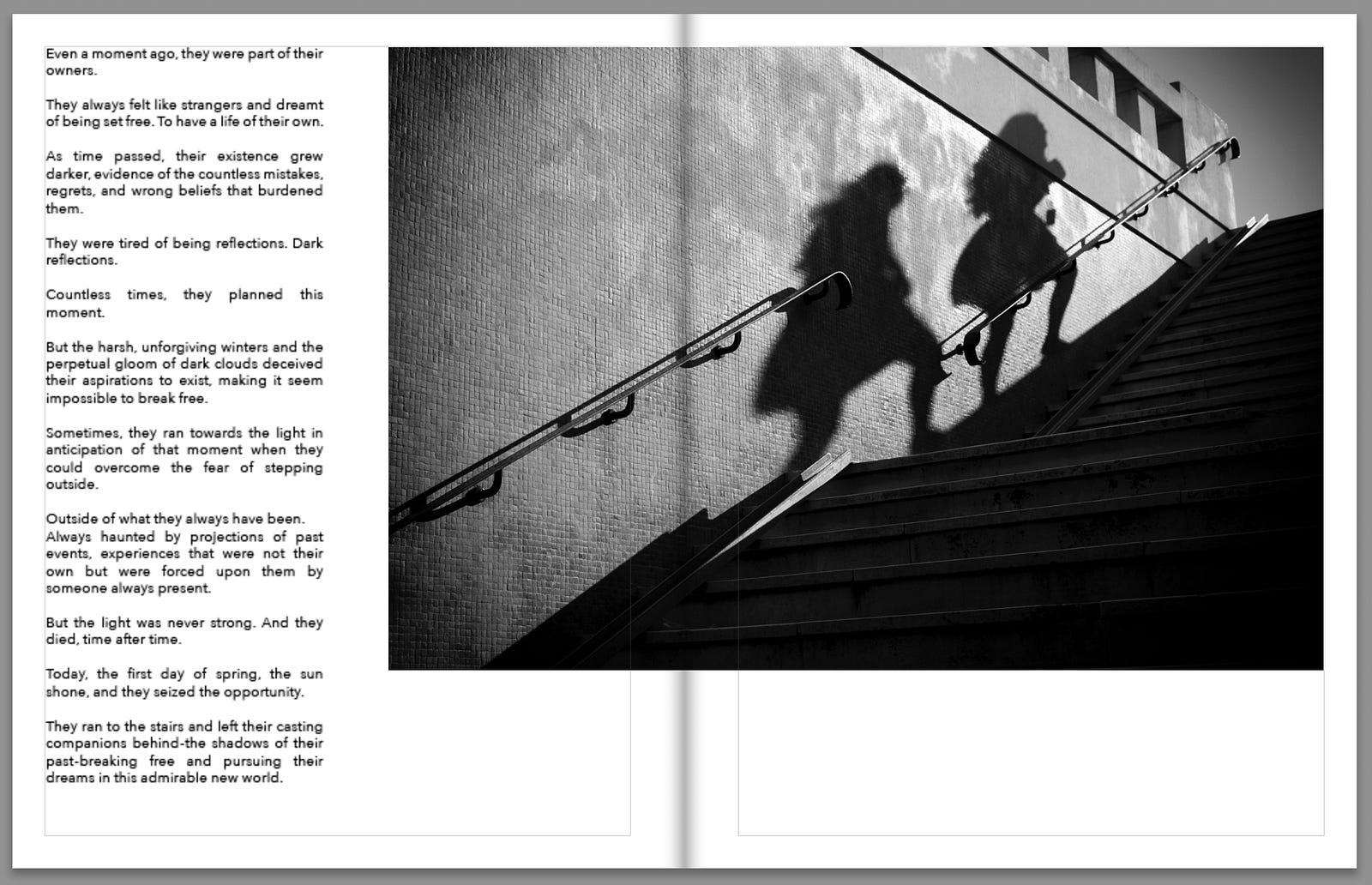
Many monographs rely solely on photographs. But I wanted to add another layer — short fictional “Snapshots” inspired by the photographs. These text fragments don’t explain the images but offer an alternative way to engage with them.
Integrating text into a photobook requires a delicate balance: it should complement the images without overpowering them. Placement, font choice, and even the ink’s weight all matter.
This aspect is still a work in progress, but here’s a sneak peek based on a draft I prepared. I rely on Snap Collective’s designer for final typography and layout suggestions.
Cover design: The first impression
A book cover sets the tone for what’s inside.
Working with Snap Collective’s designer, I created three cover mockups—gateways to distinct interpretations of “seeing the quiet”.
After gathering feedback (including here on Substack!) and carefully considering the ideas behind Seeing the Quiet, I chose a combination of the most-voted cover and my preference.
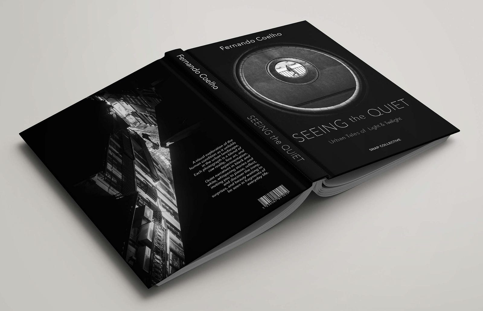
Ultimately, I decided to go with the photograph made in Utrecht for the front cover because circles symbolize balance and harmony and have a way of drawing the eye inward, creating a meditative effect, much like the experience of seeing before pressing the shutter.
This cover will introduce Seeing the Quiet to the world, visually representing the themes of mindfulness, light, and storytelling that permeate the book.
What comes next?
With the sequencing and design taking shape, the next step is preparing for the pre-order campaign. Snap Collective uses a print-on-demand model, meaning the book will only be printed if enough people order it — essentially a form of crowdfunding. The goal is to reach at least 25 copies to begin production.
In the coming weeks, I’ll share more about:
Final refinements before green-lighting the start of the pre-order campaign
Strategies for a successful pre-order campaign
Lessons learned that might help you if you’re considering creating your own monograph
I’d love to hear from you:
Have you ever considered making a monograph?
What’s one image in your collection that you think could be the start of a monograph?
If you’ve ever thought about publishing a book, what’s the biggest hesitation holding you back?
Let’s continue the journey. The book is coming to life.
Page by page is not so intimidating ;-)

Nice warmup! Love this: "These text fragments don’t explain the images but offer an alternative way to engage with them."
Definitely want to make a photo book but my biggest obstacle is sticking to one genre. I’m all over the place in what I photograph: street, landscape, macro. Makes it hard to gather a cohesive collection. Look forward to ordering your book!